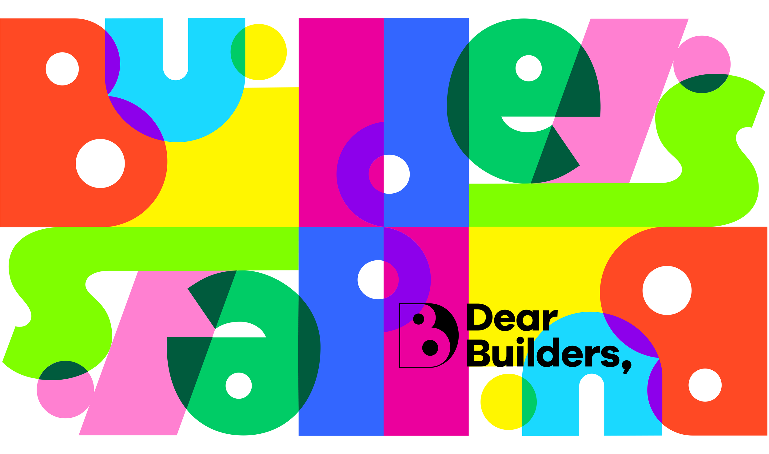
A system built from blocks.
Brand Strategy, Creative Direction, Identity System, Iconography, Verbal Identity, Substack Design, Social Templates
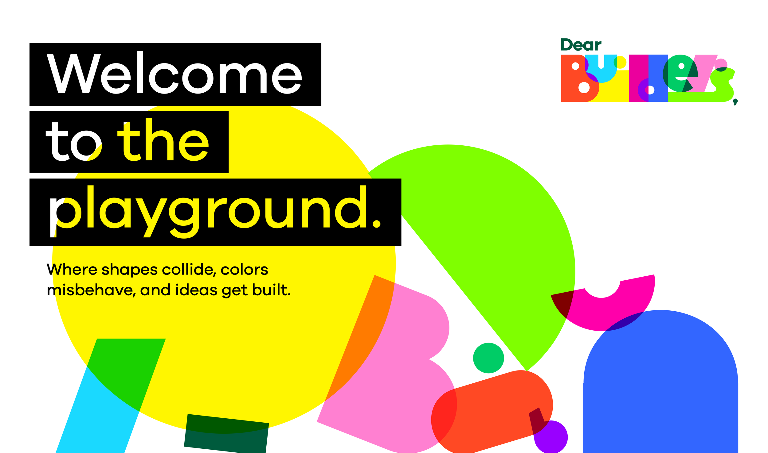
Welcome to the playground.
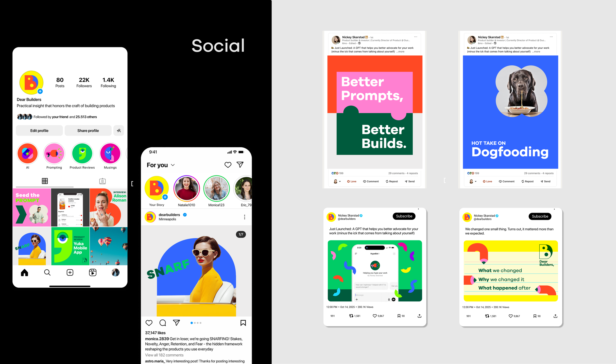
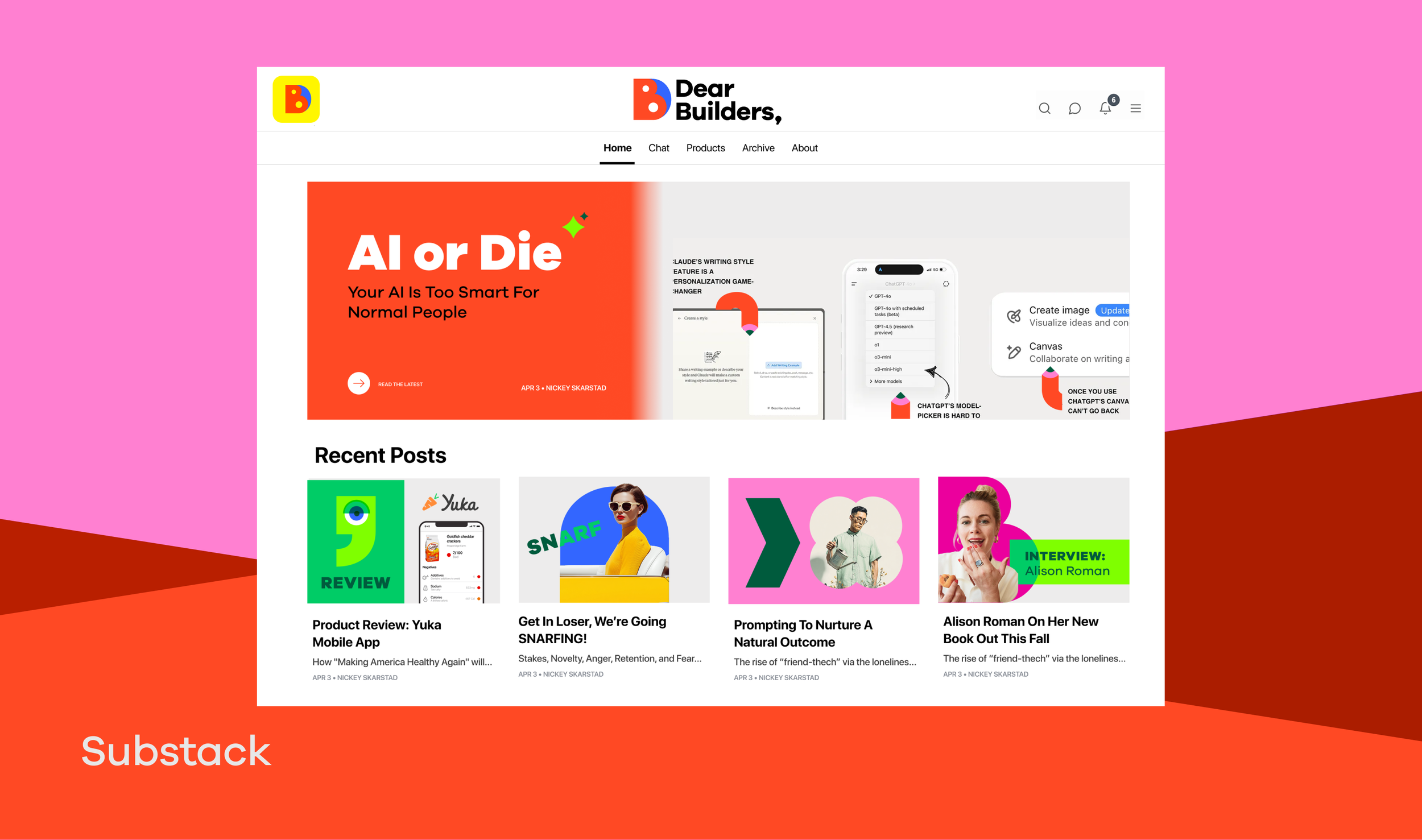
Dear Builders is a Substack for people who build products: AI tools, prompting, product reviews, and the occasional hot take on dogfooding. It's practical insight that respects the craft, delivered with none of the stiffness that usually comes with "thought leadership."
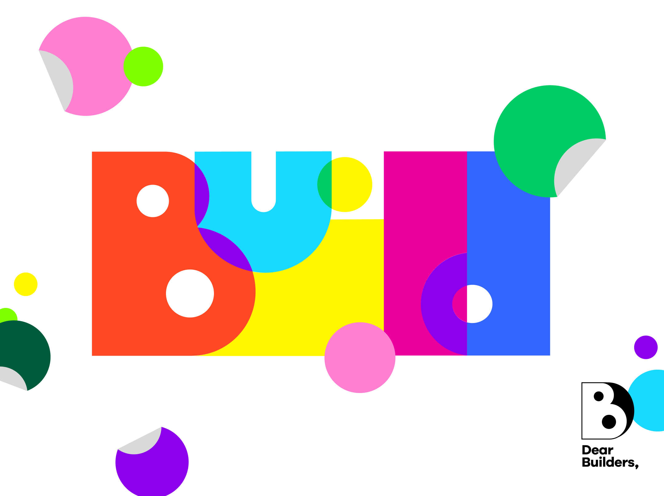
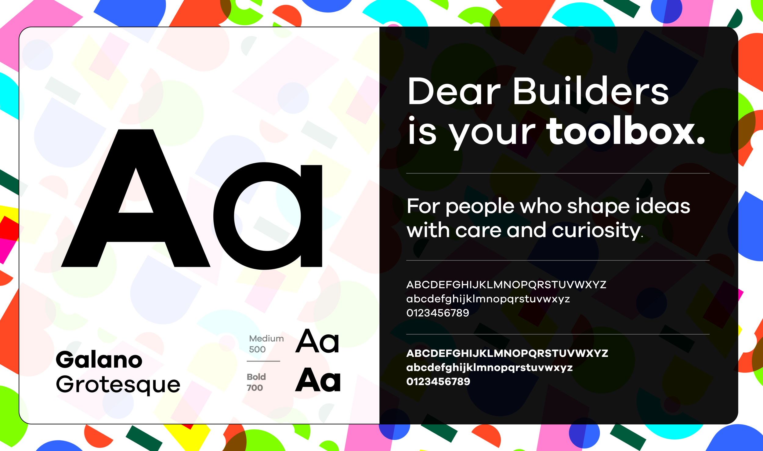
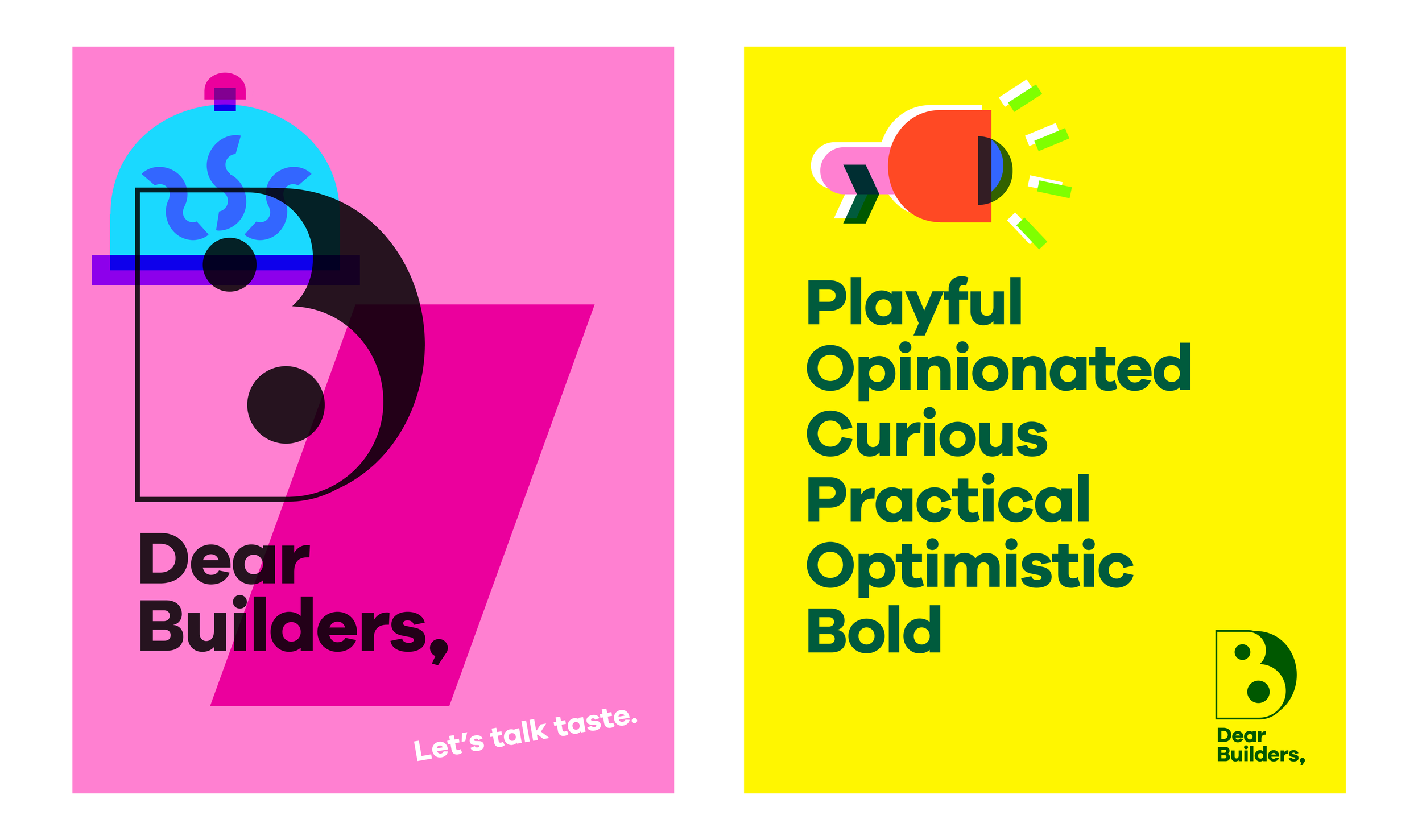
This was a rebrand, moving an existing brand toward something more modular and playful. The opportunity was to build an identity from one simple idea: things are made from parts. The logo, illustrations, icons, and layouts all draw from the same modular geometry, the shapes pulled directly from the full "Dear Builders" logo expression, so the system can be recombined endlessly without ever feeling arbitrary.
A brand built from parts had to work like a toolbox, not a poster.
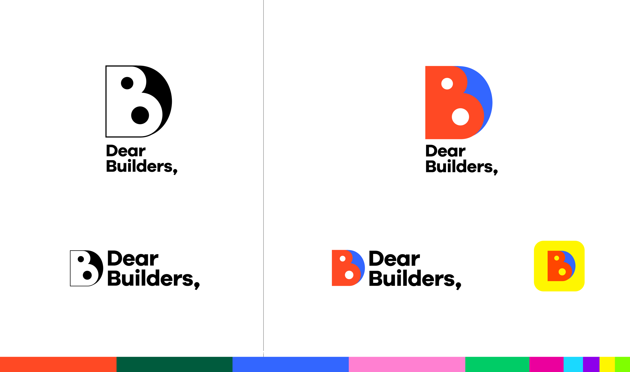
I developed the identity system around that modular geometry: a bold color palette and a full iconography set that both draw from the same source shapes.
The result is a brand that reads the way the newsletter sounds: confident, a little irreverent, and never boring.